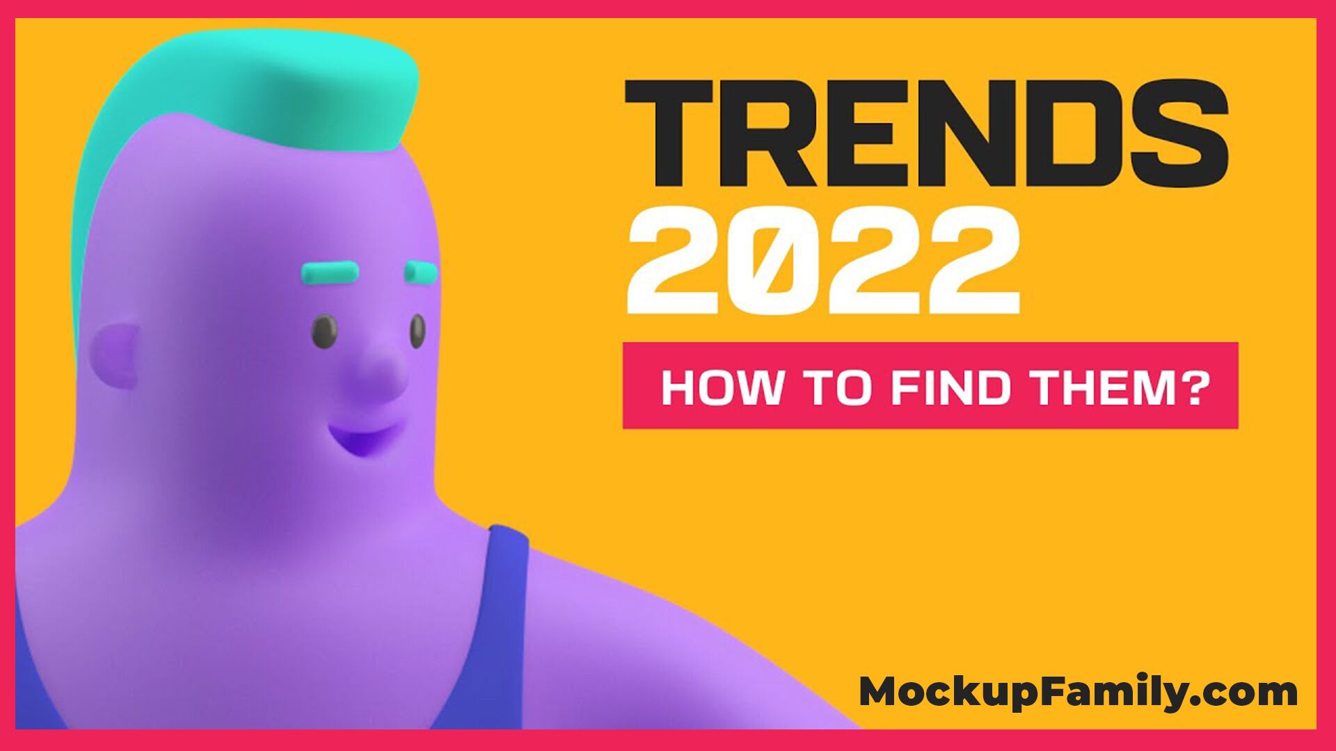
Some Of The Best Designs On The Internet

Let’s go on a journey and look at some of the best graphic designs out there right now. Why? Well, because looking at supreme designs can trigger inspiration inside you. Show you what works and what’s trending. Might even help you to finish that project you’re stuck on right now.
The first inspiration comes from the queen marine studio. It’s a lovely collection of their poster designs. Now, these posters span back to the late 2021. But they reflect the current position in the graphic design world.

The use of very bright and bold colors is an obvious trend right now in the design world. That’s often seen with color combinations that designers just would not consider five or ten years ago.
One thing that is really finding its way into mainstream society is the wonderful use of typography. You can see it in excellent use all over these poster designs. We see clean sans-serif fonts sometimes paired with serif fonts.

One trend I spoke about last year is the use of arts and crafts decorative fonts. You can see them in use on the Maximus festival posters. It’s kind of a friendly nod to the arts and crafts movements and it has become very fashionable in graphic designs this year.
These posters show the creative side of using colour and texture mixed with strong decisive typography choices. They are very creative and expressive which is nice to see when it comes to something that has found its way into mainstream society. Especially considering these are all client-based projects.
Moving on we have this absolutely awesome website yeti motion. Now if i had to pick a website that expresses the current level of excellence and what is possible in the space this would be it.
Firstly, look how non-static everything on screen is, we have a floating imagery on the home page text that scrolls across the page. A textured background and everything is responsive to how my cursor moves. Speaking of that custom cursor. If I hover it over a project such as this summer dives example here it gives us insight into the project itself. But if we actually click onto the project we can see the final motion graphics solution itself in stunning quality. If we scroll down we can see some statistics on the projects. Some neat additions such as the before and after shots on the process itself. Not only is the motion graphics from this studio mind-blowing. their website is really really top-notch too.
Next, up is something very different this is a corporate identity for a sushi bar. Where the design team has really dived into the background of the brand and the target audience. Notice how the photographs of the final design assets all follow a color scheme of black white orange and brown and that’s not a coincidence.
Also, we are shown aspects of the restaurant for context and the layout is just superb. The design team have spent a lot of time creating these illustrations that fit into the brand really really well, you get a kind of rustic minimal and authentic vibe from the brand identity. Like I mentioned before this is complemented by the choice of layouts, and physical objects chosen for the composition.
I absolutely love this menu design here with the cats on the left. the Japanese scripture in the white space at the bottom. With what looks like a real authentic stamp in the bottom right. It’s just such a cool design and I feel like customers of this restaurant will crack a smile and marvel at this menu design if their designers are not. So yeah this sort of brand design is right up there with its originality and execution.
Moving on to another brand identity but this time notice how vastly different things are from the previous one. The target audience here is obviously females due to the use of makeup. It seems to be women who are more younger than say middle-aged or old. The brights and bold colors and modern fonts suggest youth trendiness and a very cool sort of vibe. This is another instance of really awesome typography that complements a great choice of imagery and color use.
The designers of this project knew exactly who they were targeting with the art direction and they’ve gone full steam ahead with their execution. So we have a third brand identity here and again take note of how important and yet fundamental the user typography is to the final brand identity. Pragmatica is the typeface of choice which is a very sleek sans-serif font family. that’s matched with charcoal black white and accent colors of purple on the green to give a kind of modern and cutting edge identity. The business cards of this project are what really drew me in and what caused me to add it into today’s post.
The color palette is just so clever. I mean look how this vibrant green shines from the charcoal black only to be accented with that purple. The designs all work really well together and for someone like myself who does love a good typography. This project just makes me smile from ear to ear. I’m not so sold on the Wii plus u purple design here on the left. But the two next designs on the right of it are just really awesome. Especially the embossed globe made from typography.