Amateur Vs Pro | Before & After Graphic Design

Can I make these designs better? Will my designs look like tear-inducing amateur attempts at design or actually will they look pretty decent? Today I’m going to go a little deeper into each of my design processes. So let’s get started with this design right here.
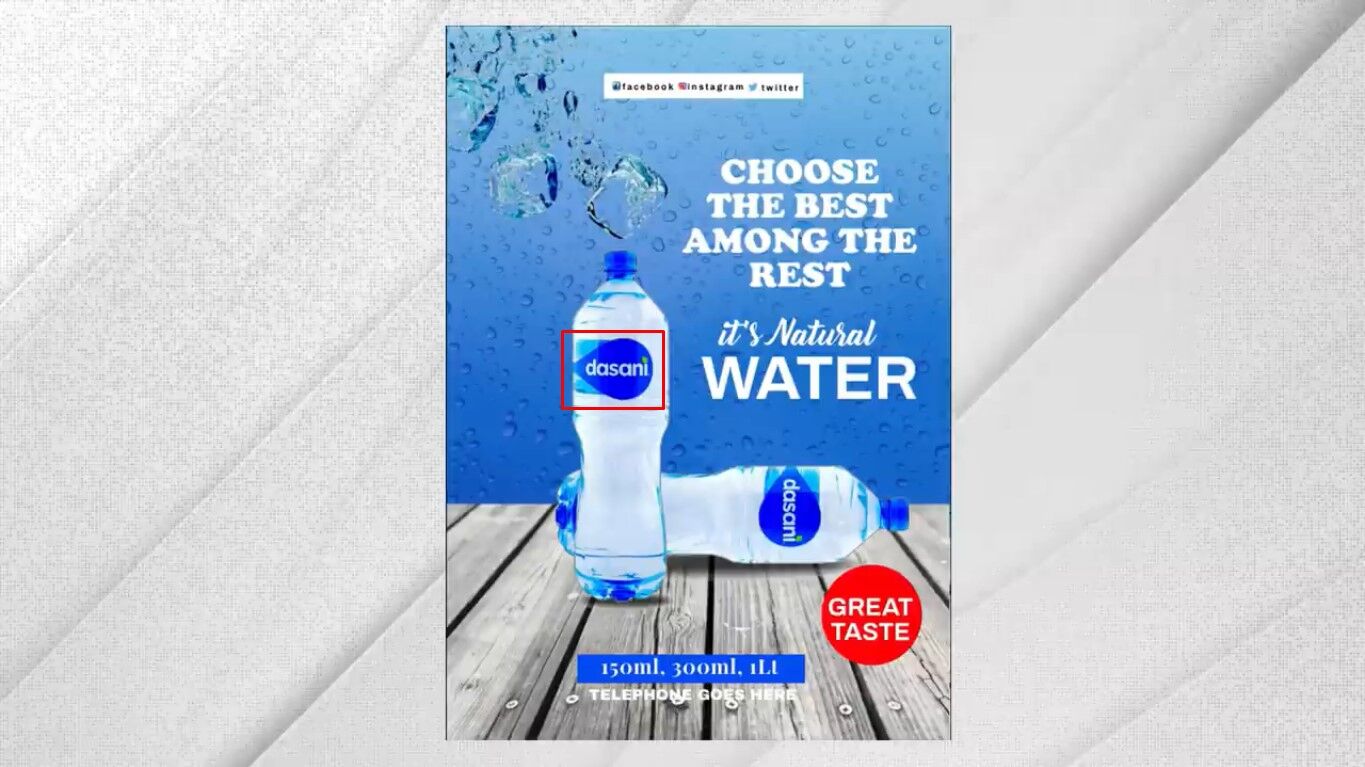
Now, this design confuses me first. Because I don’t remember the Dasani logo being like this. The design seems like a template actually. But forgetting that what problems can we see with this design?
The first thing that hits me is the sheer amount of blue used in the artwork. I kind of get it water purity freshness and so on. But to me, it’s just too blue.
Secondly, the typography is a total mess in terms of the layout. But also how at least four different typefaces have been used on a single design. This makes things look cluttered and just confusing.
Lastly, I feel there are small details that have probably been poorly thought out. And they just add up to a very generally bad design.
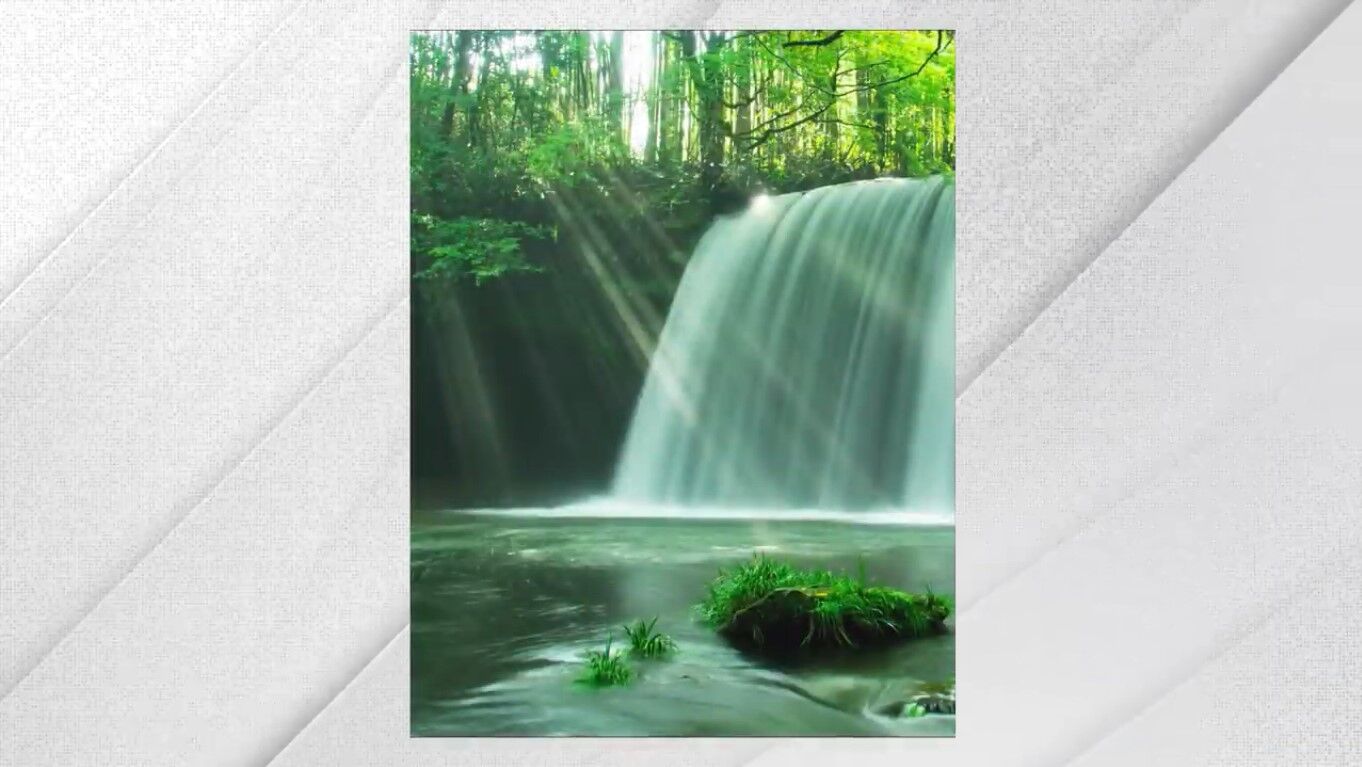
Okay, so what did I do well my initial thought process was to use a waterfall as a kind of backdrop for the design. I wanted something natural that contained water and obviously. That’s because this product is water itself and the main slogan talks about natural water. I wanted the backdrop to move away from the overuse of blue. So I tried out a few different waterfall images. But landed on this one here which is really fresh and pleasant to my opinion.
Trust me as we move through the process everything should come together nicely.
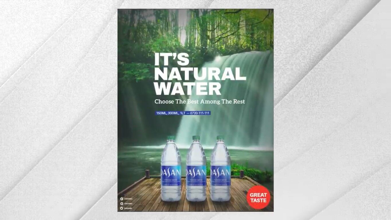
So next I wanted some wooden decking and so I grabbed this image here. Stole the decking like the Photoshop thief that I am. On the decking, I place three bottles of water. When looking for Dasani this is the logo and the brand I’m familiar with. I couldn’t find the same logo as seen in the original design.
So yeah I’m very confused about that. So this design looks awkward and unrealistic. So the next job for me was to add some shadows below the water bottles to give a sense of realism and speaking of shadows. I then added some shadows and highlights across the entire design. Which just tied it together and made it look more realistic.

At this point, I felt that the design was ready for an injection of typography. The main design suffered mainly due to poor typography choices and for the main slogan. I wanted something clean minimal, and quite striking. Aileron Heavy font in uppercase solved this need pretty well. I really like the left alignment of typography on this design.
Next up is the tagline and for this I used “Alio”. Which is a slab serif typeface. I chose “Alio Bold” and I chose a title case and not just all uppercase for the tagline. Because it’s more personal and it will contrast to the main typography. Slab serifs are commonly associated with confidence and the tagline reads choose the best among the rest. This is a very bold and confident statement and so I feel like this choice works really well.
Next, I add this little segment that was on the original design and this is fairly insignificant. But using blue as sampled from the water bottle label for this rectangle ties things together in the design. And lastly showing social media information and the “Great Taste” label.
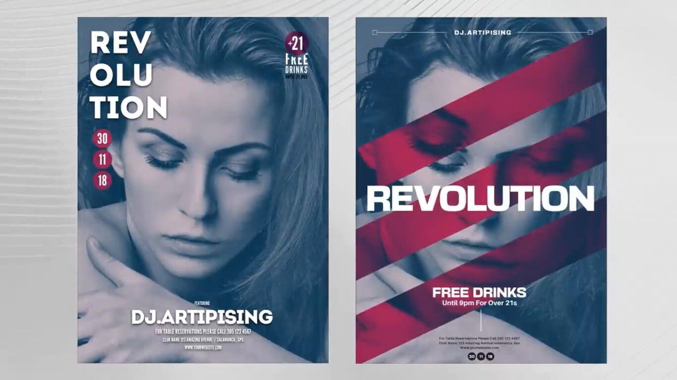
Putting these designs side by side you can see that they are quite different.

But there are also a lot of things that are objective. For example, how the original design used too many font styles making the design seem cluttered and confusing. I really think this design works well, and it’s not just a case of changing a few things on this one. I crafted an entirely different concept using the original information.
Let’s move on to the next Before & After Graphic Design
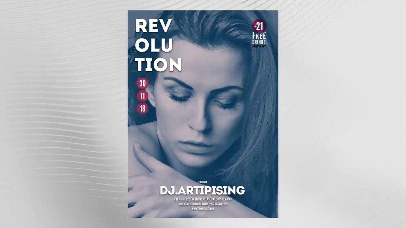
The design isn’t terrible, but I do feel like we can vastly improve it with some tweaks here and there. Now, what would you change about this design, and what do you think can be improved in your opinion?
For me, I don’t like the layout of the typography once again. And I also think the poster is quite boring to be honest. And I find it insanely difficult to make use of drop shadows on typography. To me, it almost always looks amateurish and pretty tacky. But that might be one of those subjective situations.
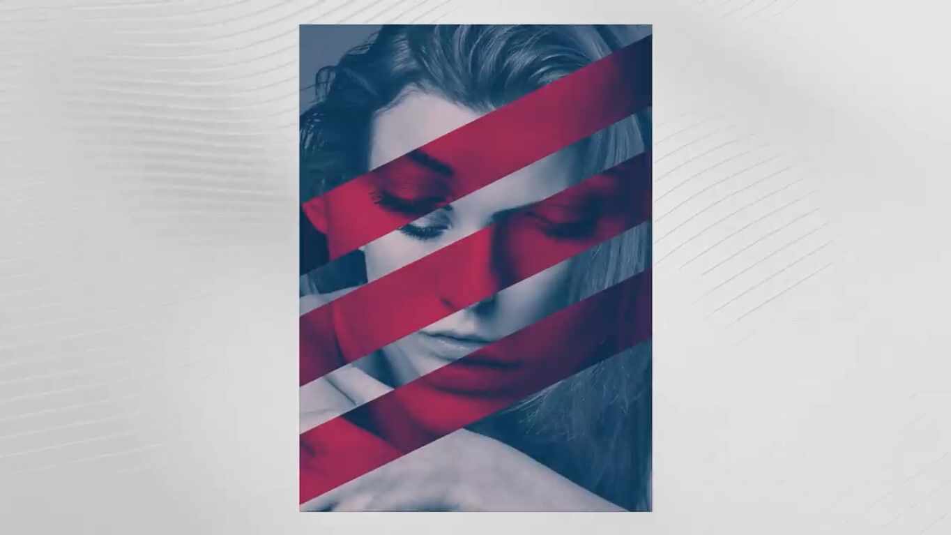
Anyway let’s dive into my process I stripped back the design. So that we just have an image of the woman. The original design was advertising a music event called “Revolution”. The word “Revolution” evokes a sense of change power and movement. In that sense, having these stripes is a good way to create a dynamic sense of movement. I also adjusted the mask within the stripes. So the woman’s appearance has shifted from the original giving a sense of change. This also just makes the design more interesting to look at.
Next up we need that keyword revolution. I’ll use the typeface that everyone knows and loves at this point and that is basement grotesque. I’ve placed it right in the heart of the design as I feel it simply just looks better here. I did experiment with other layouts, but I kept coming back to this option. Now I did not want to crowd the design and so a lot of the other information has been presented in a minimal fashion. But one that makes it easy to access and view.
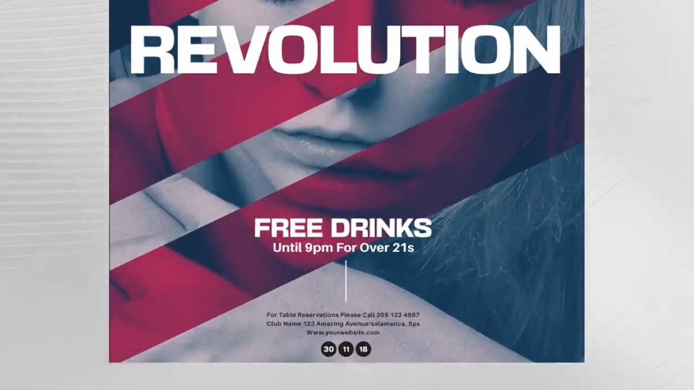
If the viewers are enticed into the design but their main image and the impacting title. They will then move closer and be able to read the other details pretty easily.
Next, I headlined the DJ’s name with a pretty basic motif at the very top of the design. And for the redesign, that’s pretty much it actually. Setting it next to the other I feel like it’s quite a big improvement on the original.
I really liked how this one ended up looking after being turned into a mockup, especially on the magazine advert layouts.

But what do you think about these two redesigns?