AM | PRO | MASTER Graphic Design 2025

In this post, we analyze key design elements such as composition, texture, layering, and color to show you how to transform your designs from basic to brilliant. Learn how to create clean, organized layouts, smart use of typography, and powerful focal points that guide the viewer’s eye. Discover the art of adding depth with textures and layers, and how to choose colors that align perfectly with your design’s purpose and brief. Whether you’re a beginner graphic designer looking to sharpen your skills or an experienced designer aiming for mastery, this post is packed with tips and insights to elevate your work.
One of these designs is considered amateur skill level and one is considered professional and the other is Master tier. So the big reveal is that this design would be considered amateur from the standpoint of composition, but why might you consider this design to have an amateur-level composition or layout?

The first big giveaway is a chaotic and almost random layout one that doesn’t help lead the viewer’s eye at all. there are various Design Elements such as blocks of typography icons and Graphics all of which are randomly placed and just do not help lead the viewer’s eye on this design.

The designer has also tried to go with a focal point with the model in the middle, but the blue circle in the background isn’t aligned properly. Even if the aim wasn’t perfect symmetry the layout choice just seems lazy and just well random.
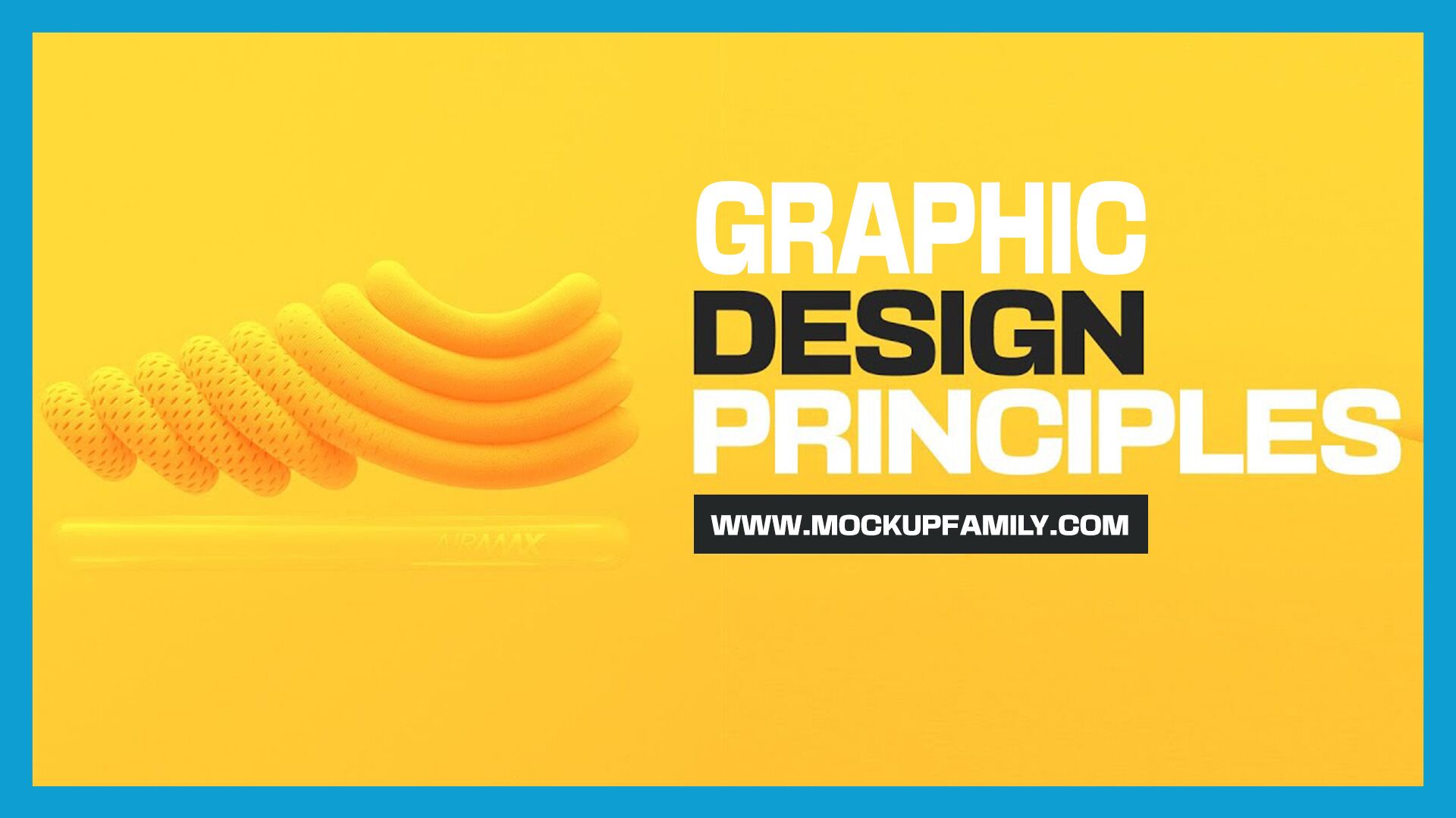
Related Post: Brand Business Card Mockup PSD Template
But ask yourself this question what would you do to neaten up this design and also take it to the pro level of graphic design skill? So on the pro level design notice how the typography now has its own proximity group, it isn’t just randomly placed all over the design Here There and Everywhere.

I’ve seen amateur designers sprinkle typography all over the designs thinking this is the best approach. most of the time this will distract the viewer and make the design confusing, instead think smart and group things together wherever possible. Also, we have a clear divide of the visual graphics and then the typography on the left, so the composition has a neat order and a balance. I’m sure you feel a lot more comfortable simply looking at this design compared to the other one.

But how can a master design actually improve on this one, how’s that going to look.

There are two but really easy and highly effective ways of thinking that can change this design to the next level.

To do that first, let’s start with the focal point over on the left, and this is so the viewer sees this first and then moves over to the information on the right.

But on this third design notice how the model’s head creeps outside of the blue circle a tiny tiny bit. This is how a master designer thinks they know when and how to break away from being too rigid and too perfect. Because in this instance the head ushers your view over to the right more so, and that’s just because it creeps out of that blue circle. Also notice how the red and San graphics on the left, also point in a right direction and this furthers that directional movement for the eye.

So to wrap up this first section for a master composition, make things neat and organized, but know to break through Design Elements, and then also keep in mind the viewer’s eye and its journey across your design.
For the second section, we are going to look at graphic designs from the point of view of Texture and Layering. This poster here is an amateur design because it’s so flat and so uninspiring. Sure some brief and some design projects are totally fine being 100% flat!

But take a look at the second design which is a pro-level poster. there is actually quite a lot going on here in terms of texture and layering.

First, we have a mixture of graphics and photography and this creates contrast and Intrigue. we have real Textures in the photograph itself and that’s conted with flat Graphics. Also inside the circle Graphics, we can see a textured pattern and again this furthers the Design’s Effectiveness. However, notice how the typography is layered behind Design Elements and it also goes from being filled to outlined. This design shows a degree of skill but it’s also not too show-offy if that makes sense, it does work as a design.
But the third design is the Master Level Design! This is texture and layering in a very very clever way.

The concept of this design is based around Focus be it visual or mental, but we can see how the designer has blurred out most of the image and added a lovely texture across it, and then they’ve left the eyes only being in Focus. This is a perfect example of how a Master Level designer uses their creativity and their skill to push a concept. It’s simple yet highly effective.
Other ways to use layering and texture for smart concepts are visible in this design right here.

This is what often separates a master designer from a pro designer. It’s the ability to think outside of the box and make a design that is original and yet very clever. Now here’s the thing do you consider that you can actually teach this kind of design thinking or is it something you either have or you don’t what do you think?
However, using texture and layering isn’t just relevant to standard designs, it can also be used on things like presentations, mockups, or portfolios. This header design here looks decent enough. But we can use texture and layering to push it to that next level.

So in the second iteration here we have added a texture background and a shadow and this automatically gives context and depth.

I also added a gradient across the bottom of the header itself but on the third design. We can add another Shadow to further the overall effect. This last added layer is a very small touch but it has a huge effect on the final design.

We so in the third section we’re going to look at color in terms of Amateur – Pro, and Master Graphic Design. When an amateur designer uses color they often make very random choices that don’t make any sense to the Pro or the master designer. For example right here on this design.

The most crucial and important thing you need to remember when coming to add a color on your design. Is what does the color say and how does it help or harm your design and the brief. So on this bright orange design if the brief aims to evoke a subtle soft and almost Tim feeling or vibe, his vibrant orange probably isn’t going to work very well. So to fit that soft subtle and possible cold nature of autumn we can add a somewhat pastel blue like this.

The pro designer will have picked up on aspects from the brief and then applied color accordingly. But the Master Level designers they take things to the next level of course. They might add a color split that matches the vertical style of the design and then also incorporate a gradient as well. This design now seems to have more depth and Intrigue and yet it still fits the brief.