Redesign Famous Logo (Logo Design Process)

I have 1 hour to 3 redesign famous logo. The question is, will my redesigns be any good? As a logo designer, I take pride in my work but I also make sure to follow a logo design process. My process typically takes anywhere from around 10 days up to 20 days. So 3 redesigning famous logos in under an hour was always going to be tough.
The thing is, what would you have done differently to these redesigns if you have the time to work on them? I know that I personally would go back and rework a lot of things. But I’m for the most part, proud of the redesigns of the 3 logos, in the time that I had.
If you want to know how I designed these logos? Well, I used Adobe Illustrator of course. I always design my logo designs in Illustrator simply. Because Adobe Illustrator is a vector-based program and I know it very well. That’s how I design my logos.
Three logo designs one hour and one logo designer. That’s me by the way. This post is going to show you the results of when I took some logos from the banking sector just like this logo right here.

Now with some experience and some knowledge, are they going to suck or are they going to succeed?
Let’s go with the first logo design in today’s post. So the first logo design that I tackled was the ING logo for the Dutch Bank. Now the Dutch Bank’s national color is orange and the national animal is in fact in lion which makes sense with this logo. That’s cool, but I’ve got one major problem with this logo and that is it’s not scalable at all.
There’s just way too much detail for this logo to ever look decent and perform at very small sizes on say like a business card or something like that. Also not to mention it does look pretty outdated and I know the lion looks pretty chill and pretty cool, but it is in fact outdated. So I wanted something simple, something iconic, and something up-to-date. So and for this lion head right here.

By the way, this is just an outline I didn’t try and design an outline style logo because I’m not crazy.
My first design didn’t have any ears. But then I took a look at the original design and I thought it would be a nice touch to kind of replicate those ears and bring them into the future logo. Also, notice the eyebrows on the original logo. The eyebrows are not slanted this way.

Which would suggest a kind of threatening nature or anger. That’s not something they included in their original design. So I didn’t want to do that either and it’s not something you want to communicate with a banking logo. You don’t want to threaten away the potential customers. So let’s flick that stroke over to a feel and then add some orange thereafter. Some Dutch orange might have had.

You might have noticed that I’m going to stack the logo in a vertical manner as opposed to the horizontal one. Because I think that’s more of an appropriate kind of way to go in this day and age and that’s simply. Because of the use of the logo on smartphones. Yes, the navy dark blue is iconic for the logotype but I really do like this dark gray that I’ve gone for. Speaking of which check out this bad boy in the full grayscale color I’m loving this actual redesign right now.

But what about in real use? How does this logo look in real-life situations when it comes to banking?
So as you can see the old card uses that horizontal alignment which might work on a banking card. But my logo still keeps the stacked layout version.

Also, my logo looks pretty different in whites on a color background, and if I had more time that is something I would see too. I did keep a serif font because I do think it works in a situation. But I made the font less kind of sharp and jagged and spiky, just to keep that more of the trust theme going. But like I said if I had more time I would definitely rework this logo as being a witch. I had nearly used up half of my one hour just on this first logo.
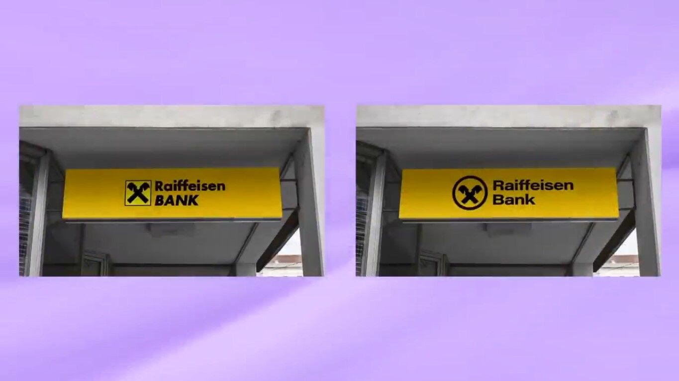
Next up, is an Austria Bank. I’m guessing it’s something like Raiffeisen Bank. Anyway, this one’s really interesting and you will soon see why later in the post. But my main issue with this design was the logotype. I really don’t get the italics on the lower half logotype it just doesn’t work for me. Also, the inner parts of the lowercase e look really dodgy, especially at a distance or a small scale. For me personally, that square needs to go. Because shape psychology would do better with a circular kind of logo.

When you’re thinking about banks trust and all that jazz. Yes, I did actually research these logos a bit before the challenge. So I do know a bit about the background of these three companies. Raiffeisen Bank I’m still probably not pronouncing that right. Has heavily branded themselves with the color yellow. You can see it over their branches their offices and their print assets it’s just splashed everywhere. Which reminds me of a different company as well.
There is another bank that I know about first hand in Thailand called Thai Krungsri and they’re heavily branded around yellow as well. So it can work for a bank and it does make sense to stand out and stuff like that. Considering the bank is so heavily branded around yellow. I don’t think moving away from that would be a good idea. Because it would cause consumer confusion the consumers already heavily link yellow to this brand. So it would be a mistake to go away from that at this point.
So this logo isn’t a doomsday symbol or some kind of construction company. It’s actually something called the gable cross and I did come across it in the research. It relates back to Europe and more precisely the houses in Europe and the roofs.

It’s meant to be a symbol of protection and security and a lot of the traditional houses back. There use the gable cross and it’s something that this bank, that I can’t pronounce anymore used in their logo branding. I decided to keep this symbol, but I rounded off the bottoms because I slapped a circle around the entire thing. As I did say the shape psychology was an issue for me. So the circle does keep that trust element going forward with this logo design.
But the biggest issue was the logotype that needed to be changed 100% so. I went for this font right here which is actually a human or assuming variable. I really do love it actually it’s really neat on this design.
You might be asking yourself where is the yellow?
Where is it gone in this instance I would actually let the branding assets do the talking in terms of the yellow parts of the brand identity. But I think this looks a lot more like a kind of banking logo as opposed to a construction logo how it looked before. Considering the time I had, I’m pretty pleased with it.

Speaking of which after that fiasco I had about just over 10 minutes left for the third and final logo design in today’s post. I was tasked to redesign potentially the worst banking logo ever the infamous toothpaste logo aka capital one. Yeah, this thing needs no introduction because pretty much everybody knows about it at this point. It used to be a lettermark logo, then it had a boomerang with a gradient and then it lost the gradient. My 10-minute designs were always going to be rushed. I say designs because there were two of them actually I made two designs for capital one in 10 minutes.
For the first one, I simply grabbed the aerial gave it that typical capital one blue, and then put a red dots at the very end. Am I proud of this logo no not at all, but I think it’s a lot more simple than the previous design.
The red dots could also resemble just one or something and that kind of works if I kind of try and jam it into the brief but not really. I don’t know it’s pretty lame looking actually, but it looks okay above a bank door so I’m pretty conflicted about this one. I guess it could work but who knows.

But the next design was an actual attempt at a logo mark. And to continue the shape psychology theme I wanted to have a rounded logo. And for this, I just went for a capital c for capital. Again I used aerial rounded which actually works pretty well for capital one I feel. So what does this show what does this all mean?

Basically, it shows that the logo design process should never be underestimated or rushed. Logos cannot be properly designed in under one hour especially three of them.


