This Design Technique Changes Everything

Now a lot of you know what hierarchy is. But do you want to learn how to properly use it when to use it? Some cool tips along the way. So what do you say should we get stuck into this powerhouse of a design principle and hierarchy.
Now I’m not going to bore you with the definition of hierarchy. Because many of you have heard me rant about it on this website before.
Yes, I’m in love with hierarchy, but for a good reason. Hierarchy Rocks.
But why is hierarchy important? Why is it such a fundamental part of graphic design?
As you can see here we have a long paragraph of text. Each line uses the same font, the same color and the same style.
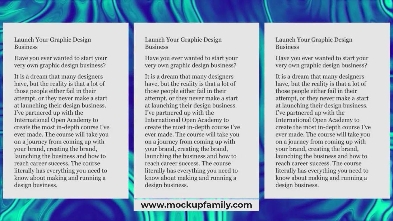
If we’re reading this in say a magazine. There is no clear importance to us as the viewer. The act of gathering information from it becomes more difficult and more tedious. However, if we use hierarchy. We can make the title larger bolder and a different color and then the subheadings different to the body text.
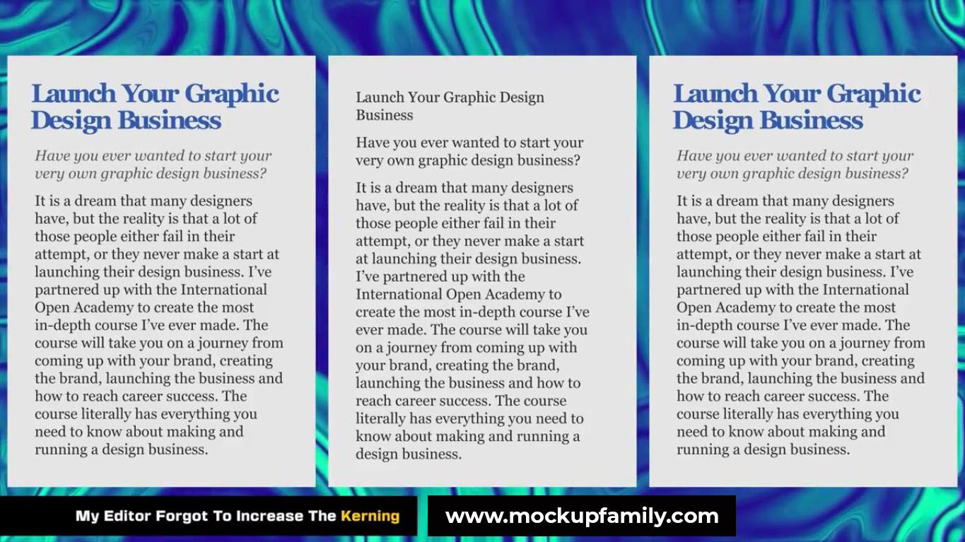
Now the design doesn’t only look more interesting and more appealing. But the reader can interact with it a lot easier when using hierarchy on your designs. Have you heard about the three level rule? Now it’s an easy rule to follow and it goes something like this.
The first level hierarchy is the most obvious and the most important aspect of your designs. You want to focus the most obvious hierarchy rules in this first level. So it could be a heading or a powerful statement or a powerful image on your design.
The secondary level hierarchy. Now, this level is not as important as the main first one. But it’s still more important than the main content of your design. This could be things like Subheadings, Enlarged quotes, illustrations and infographics or just separate large blocks of text.
The third level hierarchy is the main content of your design. The third level shouldn’t aim to stand out in kind of any way really. You want the reader to be drawn into your design by the first two levels. Then to become immersed in the body text or whatever elements you have in the third level.
It’s all well and good talking about these layers. But let’s see a real life existing design that uses this method really well. So this landing page on the apple website. Is a nice clean example of what we’re talking about.
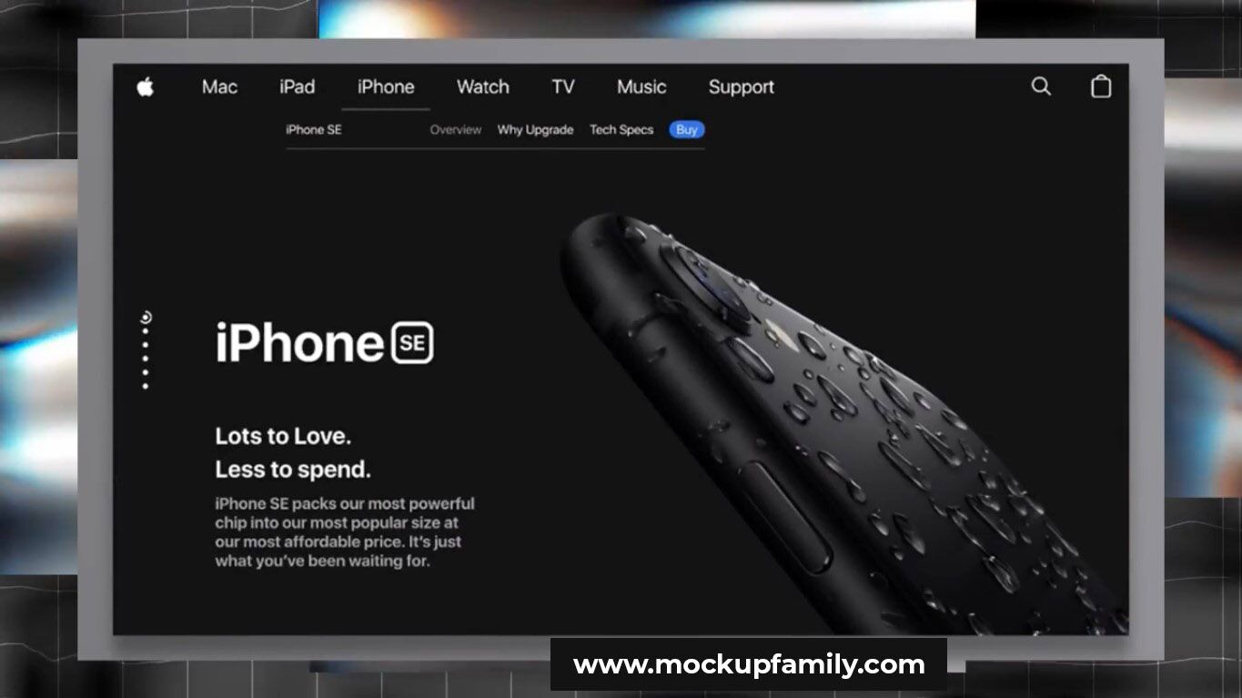
Let’s first focus on the bottom section of this design here. The image of the iPhone. Also, the word iPhone are the first level of hierarchy on this design. cleverly the iPhone is also even directing your eye to the text. These are the largest and the brightest aspects on this design in this area. But the second level is the quotes “Lots of Love Less to spend”. And then the third level is the paragraph below.
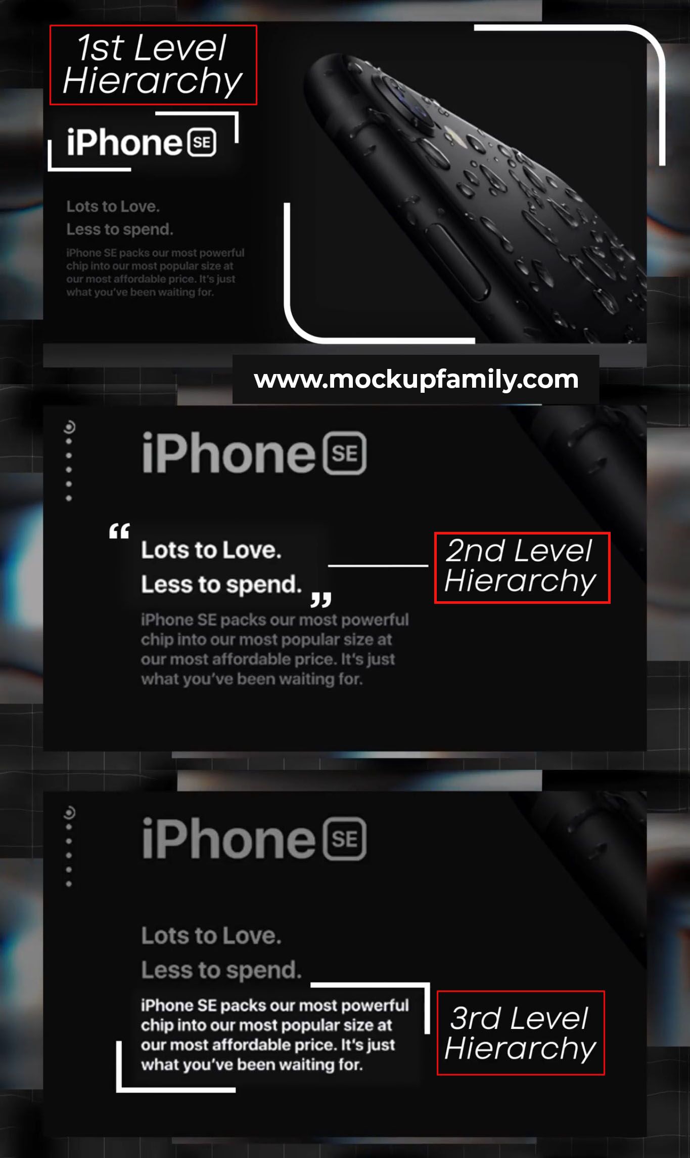
But in the upper section of the design we only really have the second and third levels of hierarchy. The blue (Buy) by symbol and the Apple logo is the second level. Whereas the rest is just considered to be the third level main content hierarchy. It is a good technique to divide your design up into different areas like this.
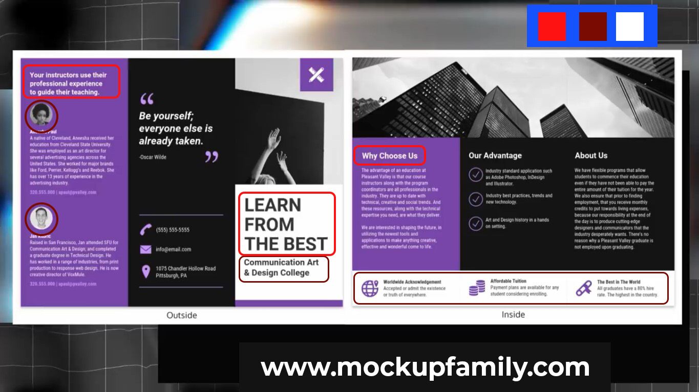
As you can see on this brochure the design has split up the work into different sections and each section has at least two or three levels of hierarchy. Headings and main imagery being level 1. Level 2 are subtitles and other graphics and then 3 being the body text and small details.
So when you’ve figured out what aspects of your design should be level one two or three hierarchy and also when you figure out how many areas you’re going to use. Possibly by using grids, it’s then time to choose what kind of hierarchy you want to use. Almost every design uses multiple different versions of hierarchy all at once. Here is your super duper 6 hierarchy list.
Weight: This is obviously the weight of the fonts you use, important areas often using bold widths.
Size: Size is a very common technique to use. The more important something is the bigger it should be on your design.
Color: Making a design asset an obviously different color from the rest of your design or design elements makes it stand out more.
Orientation: You can arrange your text and your assets in a certain way. So maybe an isometric angle where the lower-left goes up to the upper right. Then you can have something opposing the angle direction.
White Space: The next technique is one that a lot of designers forget. If you give an object a lot of white space on your design. It then has room to breathe and it becomes more obvious to the reader and that’s more important.
Font: Then finally using a different style of font. If your body text is Serif, then consider using a Sans Serif for the heading, and bingo you have some hierarchy. So yeah maybe now you better understand how to use hierarchy on your designs and you know exactly what it is.


