Graphic Design Theories Totally Changed My Designs
Here are some lesser-known graphic design theories, that totally changed my designs for the better. Graphic design theory goes far beyond typical principles such as hierarchy and so forth. Design theory can consist of very intricate and more complicated aspects, some of the things that we talk about in today’s post.
If you want to learn graphic design theory and level up your designs, then this Video and this YouTube Channel will surely help you. As a graphic designer, you should always be looking to improve and to learn new things. If your someone who works on the layout design, branding, logo design, whatever it is, mastering design theory should be one of your main goals in your career.
I bet you’ve heard the graphic design principles of contrast hierarchy and so on. What about visual tension or Rudolf Arnheim’s structural net. Today you can learn all about some lesser-known theories and you will see just how hugely powerful they can be to you as a graphic designer. One thing that took me a long time to understand the importance of was the four main aspects of visual movement. After all people do engage with our designs using their eyes being able to set up a design. Where you actively take your audience on a journey is a master skill. It does go deeper than you think the four aspects of this are.
- Shape of Element
- Subject Matter
- Movement
- Structure
Yes, this might seem a tiny bit confusing or technical, but trust me we’re going to look at some real life examples in today’s post.
Let’s look at the Shape of Element first. This is where a designer purposely uses a specific shape on a design that has an axis or line running through it. And is carried through the entire shape. This causes the viewer to actually follow it along with the design.
On this website here you can see that the beige peachy rectangle is actually carrying the viewer’s eye along it. And then to the information on the left.
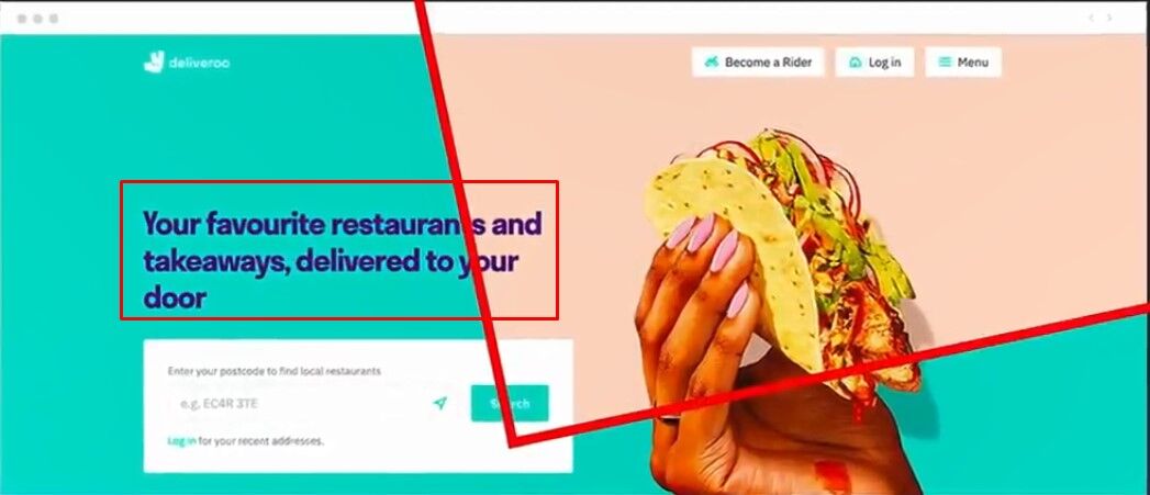
This isn’t a mistake it’s actually carefully planned out.
Then we have this poster here the design has added red slanted rectangles that mirror the viewer’s eye as it goes from the top left across and down the design to the right.

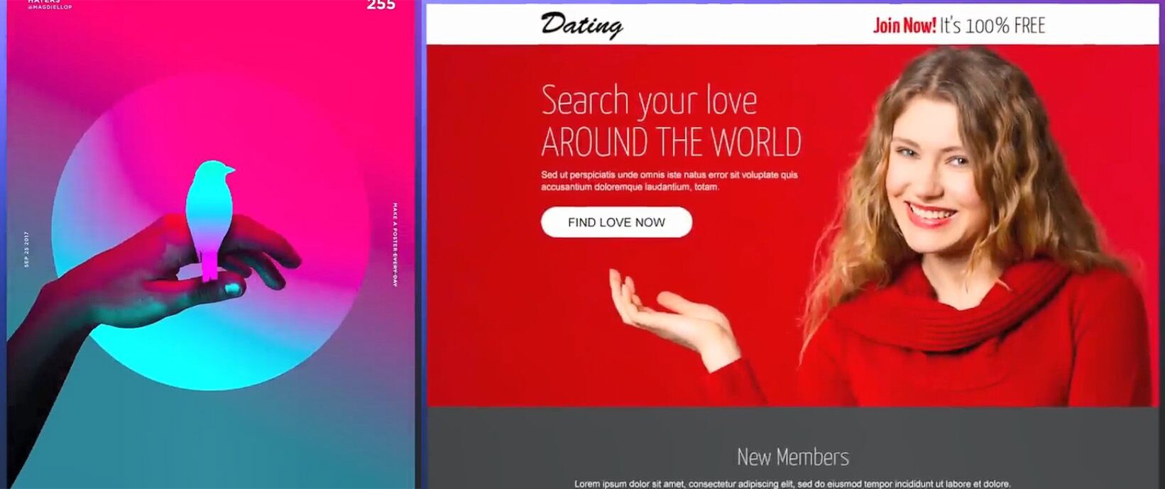
Basically, the designer has laid out a path for the viewer to go along visually speaking and they will do that subconsciously. Because going against it would just feel uncomfortable. The second point is Subject Matter, which is pretty similar to the shape of elements. But it’s more about visual cues think of fingers pointing or fists punching or eyes looking in one direction.
As seen here on this poster the arm is directing the attention up towards the bird. And on this website here this woman’s hand is literally directing attention to the main bit of information.
But what about the third point Movement? So on a design, you can have design elements that work together to create a sense of movement. An example is this poster where various different shapes create a sense of movement upward.

The fourth one we mentioned is Structure. This is where Rudolf Arnheim’s structural nets comes into play. It sounds pretty weird I know but the theory suggests that every canvas has a structure even before design elements and assets go on to it.

Crazy maybe but let’s take a look at this in more depth the structure starts with a point of focus centrally so. However, the theory suggests that it’s a tiny bit higher than the exact center. And this is where most eyes will just naturally land. Then we have the axes that run from corner to corner and the points along these axes that are actually midway between the center and the corners also attract attention.
These midway points can then be connected with vertical and horizontal lines which creates additional axes of visual force. So according to Rudolf and his theory the eyes will actually follow these paths. And they will actually land on the points of interest or focus. You may very well be able to see this in action in real life. And when you do start thinking about this you begin to see designs very differently indeed.
The next theory that is lesser known among graphic designers is Visual Tension. Like with a lot of theories in today’s post. You won’t see them on every single design and sometimes designers do them without even realizing it. However, they are very easy to get wrong and we’re soon going to see just that in action. But yeah visual tension can be thought of as anxiety or just visual anxiety. It can be achieved when design elements are positioned alongside each other that disrupt the viewer’s experience.
Now you can think of this as creating disharmony to Rudolf’s structural nets. And that’s where design elements totally go against the channels or paths that he theorizes. Looking on this website design here we can see multiple elements that come together and point to random places on a design. It just looks simply unorganized and uncomfortable to look at.

Simply because it’s disregarding those paths that we just saw. Instead, we can remove random movement and direction from shapes pointing in all directions and create one solid point of focus like on the second design here

Now here’s a very simple and effective but forgotten-about theory. The theory of overall design composition direction.
The three main directions for a composition can be Horizontal, Vertical or Diagonal.
Horizontal compositions are more calming and stable. Now I don’t mean kind of landscape designs I just mean the directional movement of the design layout.
Related searches
- How to Become a Freelancer (Best Strategies For Designers)
- Crucial Adobe Illustrator Functions | Adobe Illustrator Tips
Then vertical designs are good to show balance and boldness and alertness.
Then finally the diagonal compositions will help to suggest movement and action.
We can see here on this first design how everything just feels calm and still. The directional movement of the design as a whole is horizontal.
And then for the second compositional layout, we have vertical. Here we see more vertical direction of the form with some slight diagonals with the red strike marks on the left. The design seems more bold, more striking and impacting.
Then finally the diagonal design. notice also how this brochure has used the satori color of yellowy orange. And that’s a typical color for action and movement.
It’s no coincidence that a diagonal layout is matched to this. It’s kind of like a double whammy of psychological traits on this design. As you should be aware of now movement is a powerful tool not only to direct a viewer around your design. But also to make them feel comfortable or uncomfortable depending on what you want them to feel. But as we’ve just seen it’s possible also to set a base feeling or emotion simply by looking at the layout and directional movement of your composition. Never ever underestimate the power of this stuff. And next time you’re looking at graphic designs consider the design theories in today’s post.


Came here to say that the main graphic has a typo in it. “Design Theoty”
You may want to fix “Theoty” in your theory title.
Maybe “Theories” is perfect this title
Typo on the first graphic. Ouch…