Graphic Design Principle | Space

I’m sure most of us know about white space and negative space in graphic design. But do you get confused or lost when it comes to actually applying these things to your designs in real time? We’re going to be looking at the design principle of space. So we can end up with beautiful designs that wow clients. So before we look at some real life examples it’s important to understand the benefits of mastering space in your designs.
Firstly, if you utilize the space properly it’s going to enhance a visual hierarchy. Which is another very important principle in the communication of your design.
Secondly, space prevents your designs from being cluttered. And cramped that’s not something you want on your designs. Space also simply adds style and elegance to your designs if done correctly. That’s what we’re going to talk about soon. But also when used correctly space also emphasizes bonds between visual elements essentially it just enhances proximity. This is useful for allowing your designs to make sense. When designing something in regard to the use of space.
Firstly, ask yourself. What is the contents you’re working with?
What has the client given you?
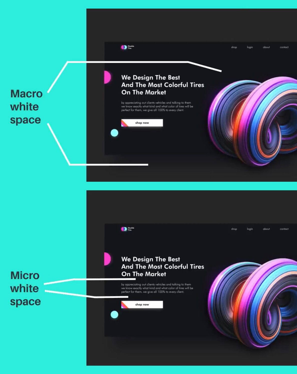
It’s important to distinguish between macro white space and micro white space at this point. Macro white space is the large expanse areas of nothingness that exists on your design.

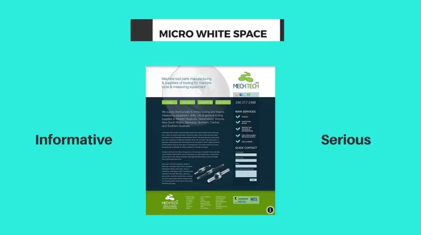
Whereas the micro white space are the areas of smaller sections of nothingness between lines of text, paragraphs of text, and closely packed together design objects. For example, if you’re working on a design where the client is giving you rooms and rooms of text to work with. You’re not going to be focusing much on macro white space. Simply because you don’t have much of it to work with.
Your whole vision and approach for that design should then shift to focusing on using more micro white space effectively. However, you will still have elements of macro white space to consider albeit a lot less.
Now if you find yourself in a situation on a project, where you’re able to work with both micro and macro white space. It’s important to consider the message of the design and also the target audience. You want to find the right balance of micro and macro white space for targeted people who’ll be viewing it. If the design is a poster targeting mainly young business professionals who will view the design whilst briskly walking along the subway to work. You want to tip the balance towards using more macro white space. This is so your design remains easy to digest and recognizable at first glance.

Having lots of macro white space will just create emphasis and hierarchy on the focal point making the design more noticeable. One rule of thumb that you can use is that more macro white space can suggest minimalism, modernity and luxury.
While if the balance is shifted more to microwave space. The design can be seen as more informative and serious.

Things do go deeper than just macro and micro white space however. We can enhance our designs with the use of passive white space and active white space.
Passive white space refers to the micro white space that helps legibility and the aesthetics of a layout. That is without guiding the view in terms of structure and viewing order.
Active white space on the other hand relates to helping the viewer move through your designs in order and structure.
If we take a look at this example of a paragraph. This design has poor use of microwave space. It’s essentially just not even that legible.

If we add in some passive white space we can now read it properly and the viewer has more of a pleasant experience.
But we can go further and apply active white space to control the order and the movement of the reading experience.

Things are now broken down into digestible chunks, which helps the viewer move between each part of the design easily. This ensures they will remain on your design for a longer period of time.
To summarize when considering the use of space on your designs, it should always be legible whatever you’re designing. Also, unless the brief specifically calls for it. You don’t want the viewer to feel cramped and have a tough time navigating your design. You then need to consider the balance of micro and also macro white space that you’re going to use.
Things that determine this are the message of your design. The content is given by the clients. The target audience and the context of the design in real life situations. Use space to enhance other principles such as hierarchy and proximity. Then lastly consider passive and active workspaces.
If you didn’t actually fully understand all of today’s post. Go back and watch it again so you can fully digest the content. Also, look for white space in existing designs. How they’re being used is the white space there to guide a viewer around the design. Is it used to help things be more legible.


