Logo Feedback | Logo Design Concepts

So sometime last month I set a logo design competition and I promised I would go deeper into some of the designs that you sent into the competition. Now I hope one thing will be made very clear in today’s post. That is choosing cliche or generic ideas for a logo concept does not work.
This post isn’t a shame anybody or anyone’s work it should be a way to understand certain things in logo designing.
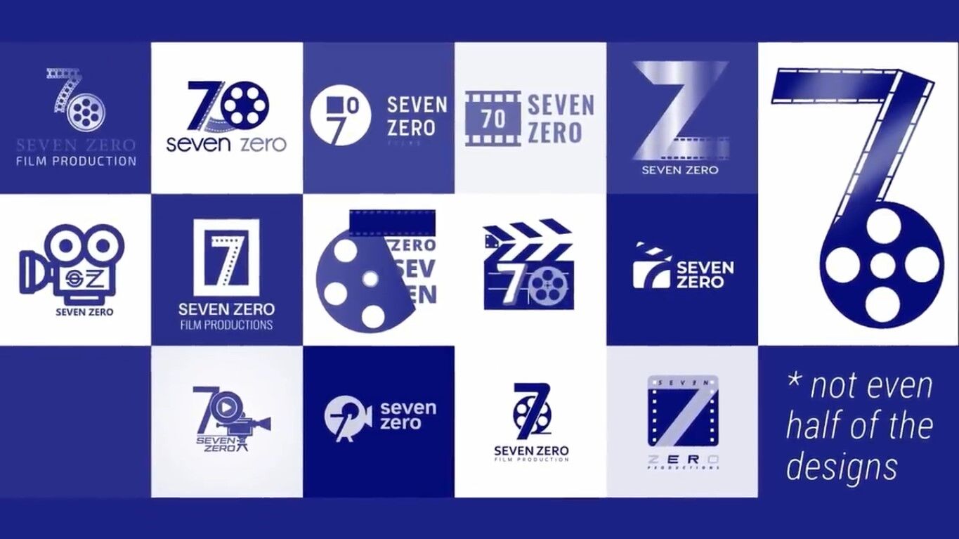
So in the end, just over 300 people enter the competition. I would say at least 25 of those who entered were made up of two concepts. That being a film reel or even just a film itself. That was meant to represent the film that you find in old school movie cameras. The other concept was that of the Hollywood kind of action snapping boards that they use. I mean take a look at how similar these designs appear when grouped together.
Now, why is this a problem? And why is it not a good way to come up with a design concept?
Looking at these designs, they are so similar they lose any kind of identity. They are easily forgotten due to their lack of uniqueness and shared appearance. If you ask a non-designer to make a logo for a film brand. They would suggest a concept pretty similar to this. When generating concepts stay away from these generic ideas. Because look your logo is going to become lost in a sea of similar designs. These logos grouped together and not even half of the ideas that were sent to me looked like this.
So it’s the first thing I want to talk about in today’s post. Stay away from generic and obvious ideas or concepts. One thing I mentioned in the brief is that it might be a good idea to experiment with the numbers 7 and also 0 in numerical values. That’s obviously due to the fact the brand’s name is seven zero. There were a lot of interesting designs sent to try to tackle that problem.
But this white design on a red background did stand out to me. It actually was in the top 10 of the entries sent to me. It did prove a tough choice to leave out of the top three. In principle, I like the logic I like the uniqueness and its clever design. I don’t like where the trademark symbol is placed. I also don’t like that square kind of dots in the upper right, I just don’t think it’s a good choice.
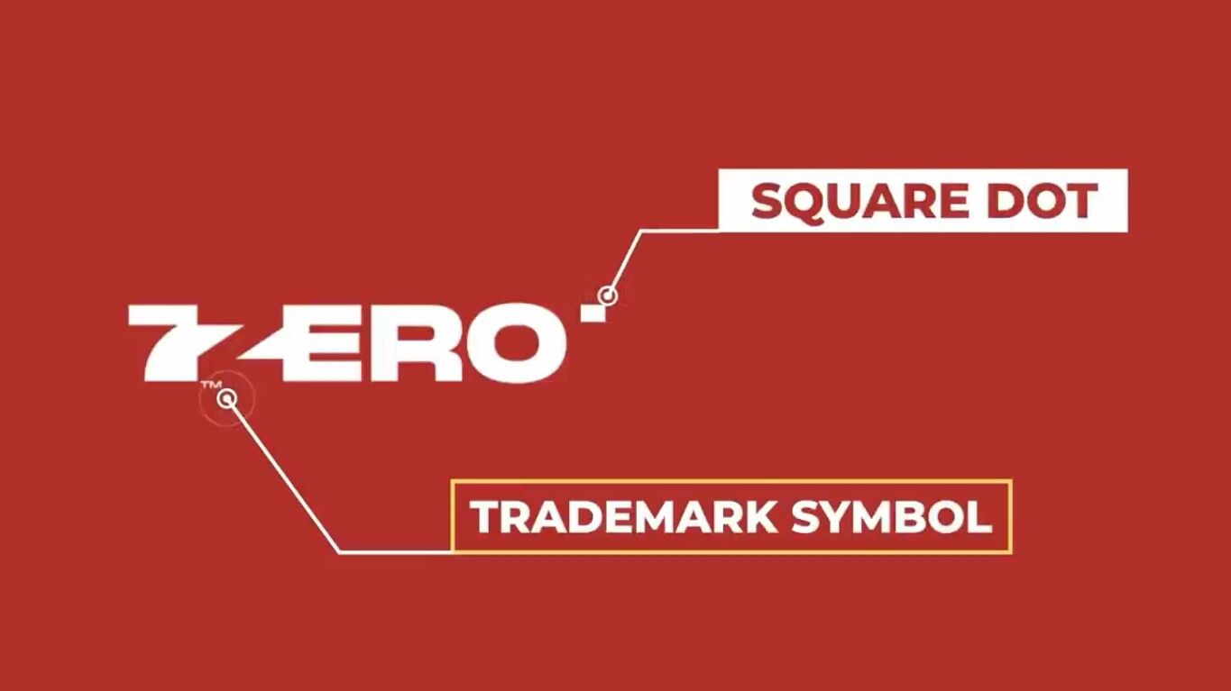
But this kind of design that is more memorable and more brandable was on the right path.
Another design that explored the numbers 7 and 0 was this one here.
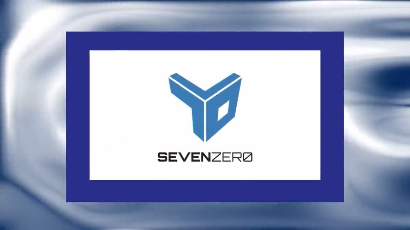
Again good logic but I feel like the end result has a few issues. Firstly I’m not sure if blue fits into the brief and the background of the brand itself. It’s something more conventional for financial companies or social media kinds of platforms. Something I used to do a lot to my early career is to have two different font weights on one line of the logotype. Yes, it can look good but for the most part, it’s often a bad choice for a logo. Still, I like the originality and I also like the approach that was thought about for this design.
Another design that was in the top 10 for me and for the people who were judging. It was this very simple typography logo here.
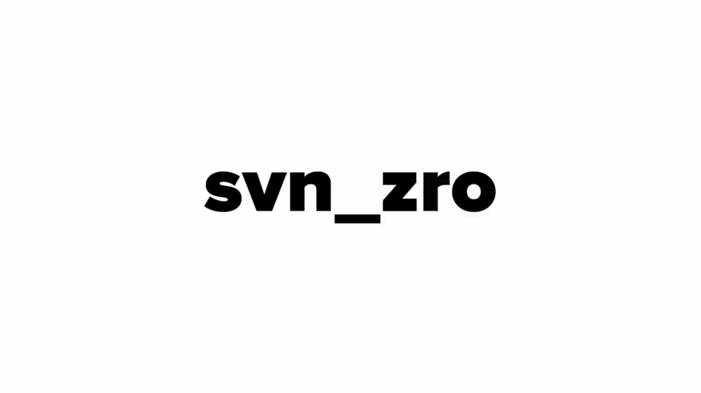
This was very unique and there isn’t another design like it that I saw. it’s trendy and it’s modern with that lowercase sans-serif font. It’s a design that you will find difficult to forget. Simplicity is almost always a surefire bet when it comes to creating your concepts. And we found it difficult to edge this one out of the top three.
So this design here has also gone for the simplified read.
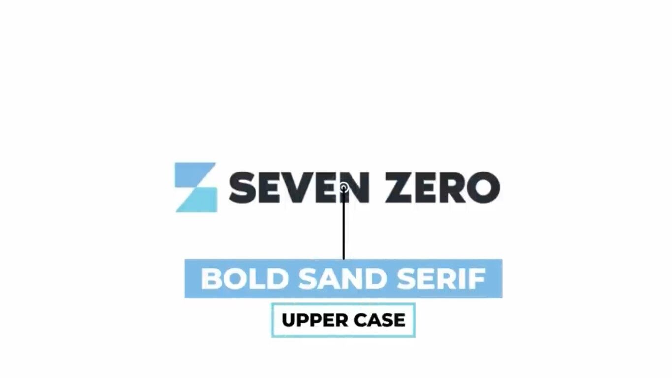
Again we see a bold sans-serif font but this time uppercase. I think for this brief both lowercase and uppercase could have worked depending on how they were used.
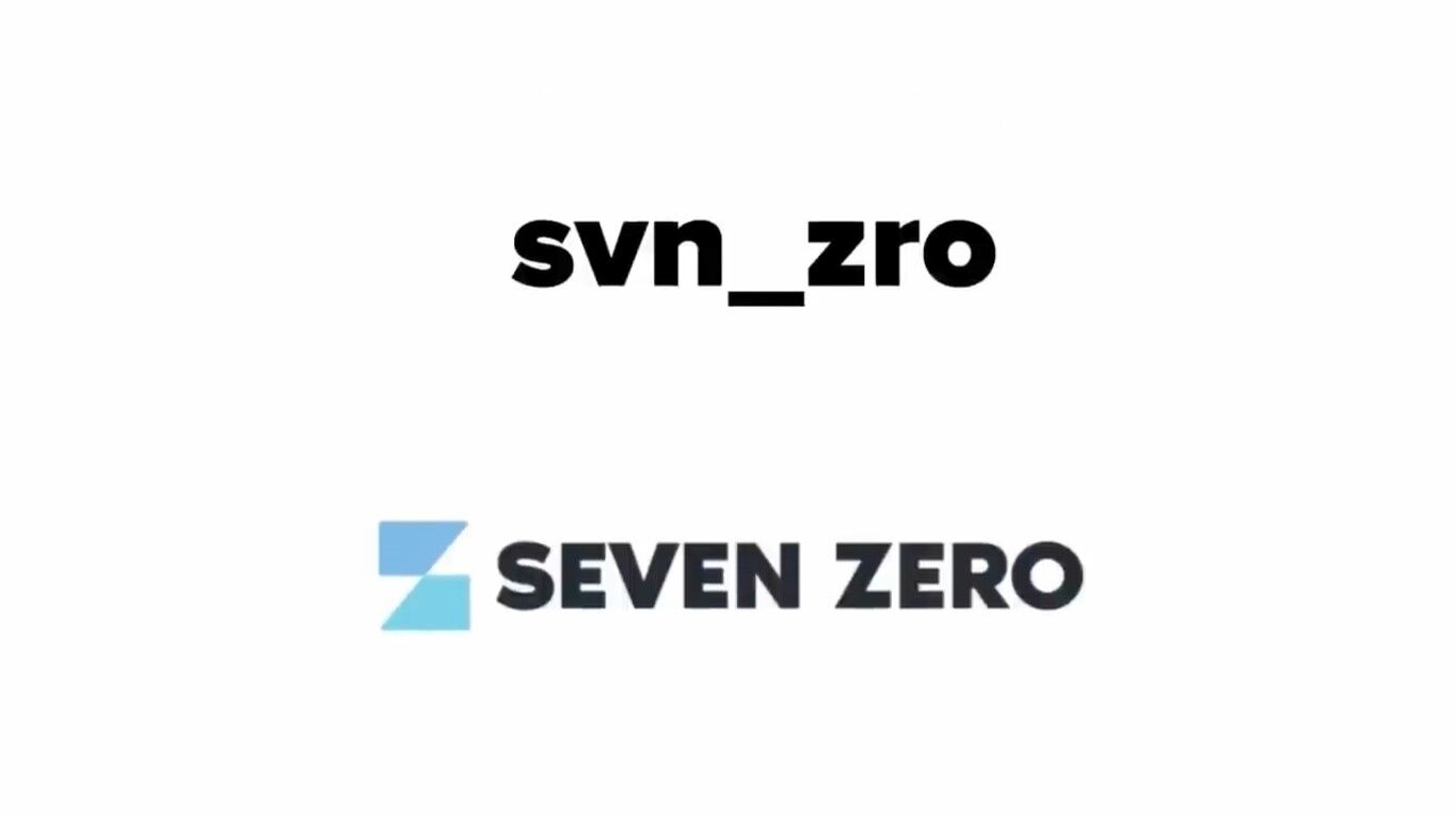
I did like the way the designer was going but I felt like it still isn’t refined enough and it’s not finished properly.
Another kind of concept that kept coming up was the literal symbol of the old film cameras.
Yes, it’s another generic design that will become lost, but like with the other concepts of an actual film, it’s an outdated technology. The brief spoke about a trendy and modern company that was trying to make a name for itself in the industry. Having a logo that utilizes outdated technology as the symbol is almost always going to be doomed from the start. Remember to pick out the words in the brief that are essential and important. And then make decisions based around those words. Trendy, Modern, and Cutting Edge do not appear in this kind of design.
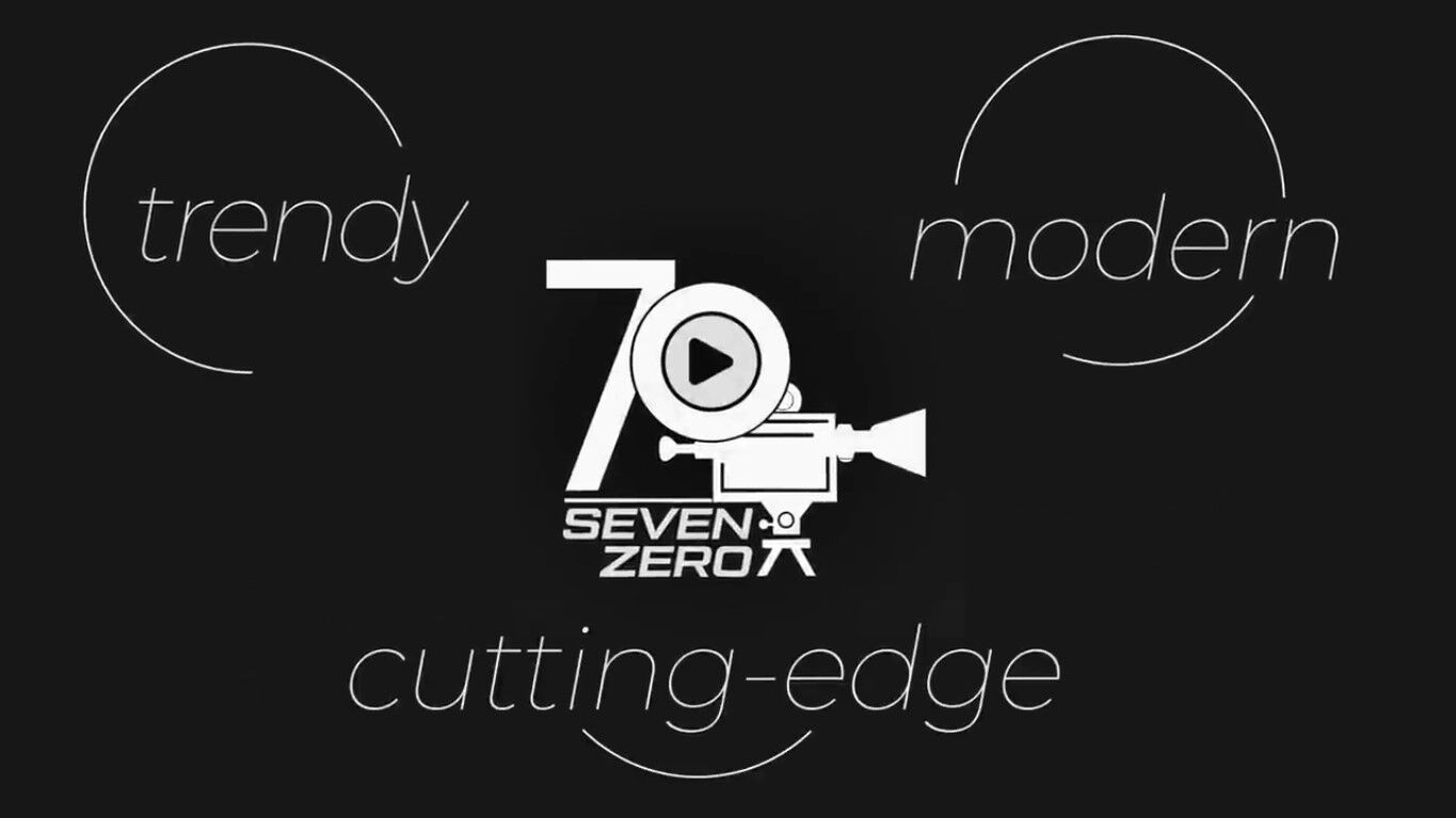
So again I’m not slamming or bashing any designs. I myself have designed some bad logos and off-brief designs in my time. And I think we probably all have done that too.


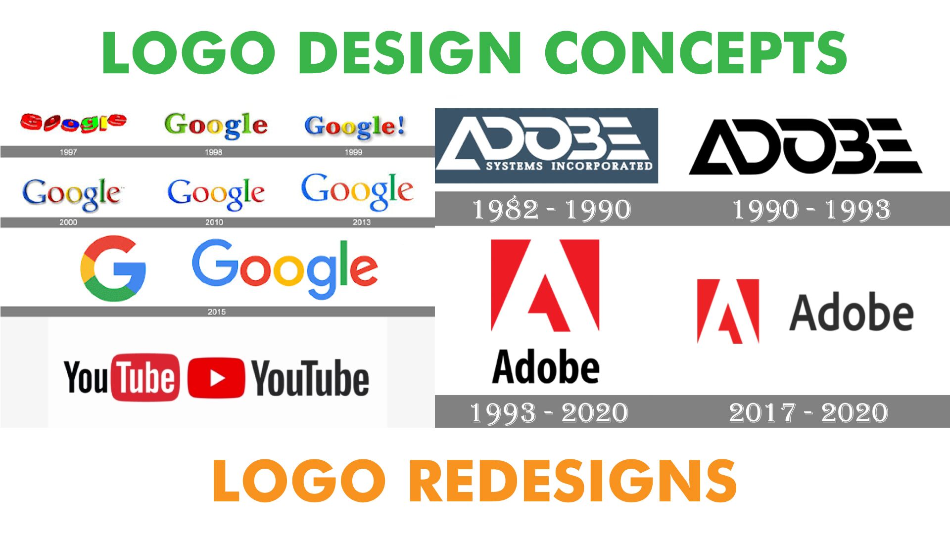

This was so awesome. I was once a professional designer for print and web, but I can see my skills were half baked the whole time. I never went to school, and I was sort of placed in that role because of my networks and opportunity. My actual were illustration in various markets. So I would end up trying too hard to do “designy things” to make it look like I was a totally branding expert. But in many cases my ideas would come out way too generic, and obviously like I’m taking it. Or I would make concepts way way to outlandish, flamboyant and “creative” in that band logo/metal album cover type of thing. Which is obviously fine for bands, comic books, animation and other c earlier industries. But not for companies that were in the tech sector and related. So I’ve been wanting to get back to making design a career path. But this round I’m making sure to really drill down in my design awareness and thinking. And I saw my design style in the past with all those movie reels. And that’s just ir, design and branding isn’t just about killer composition and making this semi abstract illustration with cool fonts. It’s about conveying a piece of information that will act as an anchor for brand awareness. And that’s where simplicity based around the company adjectives is key